
Transforming several raw spreadsheets into actionable business intelligence requires hours of manual data scrubbing and formatting. This is where we will play a key role in helping you by bringing clarity to your data chaos.
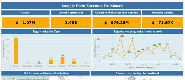
This sample ‘Registration Summary’ dynamic dashboard allows you to make head and tail of your event’s registration – ‘Who’ your registrants are, ‘Where’ they come from, ‘What’ items do they purchase, ‘What’ source platform do they use, ‘What’ is their purchasing power and a lot more.
If you think this is the kind of reporting solution you are looking for consider purchasing our ‘Analytical Support Plan’.
View Full Dashboard
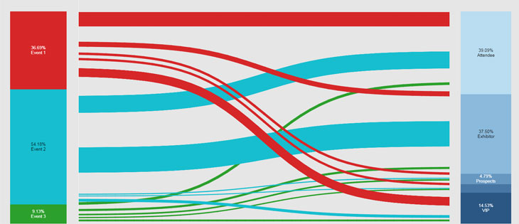
This sample chart allows a planner to identify the revenue proportion generated by each of their three events between various registration types. The larger the flow the larger is the proportion of revenue generated by that registrant type. Such advanced Sankey charts ease the complexity of revenue analysis across multiple events.
View Full Dashboard
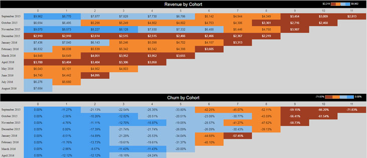
Company X holds tradeshows every month with their client base, generating $9963 revenue from the the first tradeshow in Sep'2015. While they added $6694 revenue in the following month from new clients, they were also able to retain over 88%
(100-11.27)% of the revenue from their old clients. So by the 11th tradeshow, the company was still retaining 28% of their revenue from their oldest clients.
This means 1 in ~3.5 registrants who registered when the tradeshow launched on Sep'15 were still actively engaged.
While the top chart explains revenue from existing clients vs new clients, the below chart depicts churn in every month's revenue from tradeshows.
View Full Dashboard
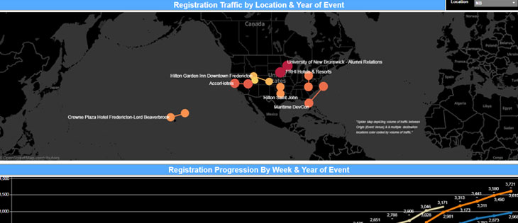
This dashboard gives you a week on week progression of your registrations and also allows you to compare your current 2018 event registrations with your 2018 Quota or even your previous year registration actuals. Based on how the registration numbers have been trending we can also incorporate visual calculations that may enable a planner to forecast what numbers will we finish with at the current pace. The planner can also use the location filter to analyze from where the registration flow is maximum and where it is the least.
View Full Dashboard